Thursday 22 January 2015

YCN Pitch 1


Peer Crit

5 Peer Strengths said about my work:

1. Well thought out and researched, audience, packaging, format and where it can be seen.
2. Strong Concept
3. Great Media Experimentation
4. Clear understanding of Brand
5. Love the birds Head's on the bottles

1. You have a clear and thought out concept
2.You have strongly considered the context for where the products/advertisements can be seen
3. I think the idea of using birds is a great idea and works with the company name.

List 5 areas of improvements

1. Look at similar competitors (already have reiss, jaeger, neal's yard, French connection as I work in the VQ across from Whistles)
2. I think the boards need to be toned down.

1. I like the bird theme but do you think it's a bit feminine to appeal to men [Have you not see what men shop in whistles? It's not the masculine type]
2. Pitch board could be more professional
4. Colour scheme needs to be thought about. 

List 5 questions that need answering
1. How are you converying the fact it's their first ever scent?
2. The brief gives you strict typography structure how will you apply this?
3. What does the perfume smell of?

1.How will you use colour? [everything in whistles in monochromatic so I'm going to try to stay close to being on brand with packaging maybe explore with the bottles.]
2. Who is your audience.

For next time:

More resolved visual concepts
More appropriate // considered visual aesthetics
More Professional Clearer Pitch
Clear Timescales and Deadlines
A refined brief (including audience)
Production Tests
More work
Mock-Up's
Contextualisation
Feedback you've already got.


Wednesday 21 January 2015

Life is Beautiful


Life is Beautiful (3D Animated Short Film) from Ben Brand on Vimeo.

During this module I have watched a lot of 3D CG animations and this one is by far the best one I have seen all term. I think there's something magical about the colours and opening sequence that kind of reminds me of Up. Maybe it's also to do with the fact there's a little man who wears glasses. But don't let this fool you. The story is a lot darker than you would expect. And the character has a lot more to him. From his perspective the world is pretty bleak, being vertically challenged often doesn't have its perks, he goes un noticed by society and gets abused on a daily basis.

As far as the limitations go with this animation, I didn't really know what I wanted to say about it, other than colours and a certain style don't have to mean a happy plot, this film has a really dark plot. And therefore I think a limitation of what 3DCG mainstream "hollywood-esque" films have done have created this feeling that all animations that are done in 3D are going to be bright and happy, because really it is mainly the stop motions that cover the dark stories. Now you may be able to think of exceptions but I'm talking about in general this is how they are perceived.


http://www.ikbenbrand.nl/HOME.html

Do Penguins Fly?


This short animation is 8 years old now, but it's the stage a year in front of me which is why I thought it would be good to look at, because I think it's important to see how far this guy has come with his studio. But at the same time a big limitation of 3DCG animation is how fast software develops. There's always new features and new things to learn, and software has come on leaps and bounds since this was made.

Now I don't particularly like the character design of the little eskimo but I do think that the way he leaves the boat and acts throughout this short is very heavily inspired by the traditional 2D hand drawn animations you see, like looney tunes. I think this is very unusual for 3D CG animated shorts to remind of, normally they have there own style within the computer and it takes a lot to bring it out. This also being a limitation.

I have since looked at what Tsumikae has been up to, they are now one of five who run Planktoon studio. Which seem to be one of the most productive studio's I've looked at in a while, there's so much content on there website. Their studio reel is incredible, they appear to have their fingers in all kind of pies, from animation for games, to commercials to short award winning films, to idents for tv channels. The sophistication of the animation is on leaps and bounds from flying penguins. But what will always resonate with me is the humour in that, I'm pretty sure you'd be hard to find another animation with a flying killer whale in.


SHOWREEL 2015 from Planktoon on Vimeo.

3D Motion Graphics


I saw this motion graphics piece, for Person of the Year (Ukraine) on vimeo and fell in love with the shiny leaves (which I appreciate might not be everyone's taste), but felt that 3D CG animation is prevalent in the industry. Alexey Romanowsky mainly creates motion graphics in Cinema 4D and some have even been taken on by the software as templates, but this is one of his earlier ones that I chose to comment on because although I really like it I think theres a few things that could be improved in this one, whereas the others are super professional and look amazing. I think the particles to form the title move too slowly and the leaves go too fast. I think it would of been nicer if the leaves had of grown out individually or with a bit more follow through because it doesn't flow in an organic form. I also think a better music choice could of been made, but I know the eastern europeans like there cheesy music.

After looking at Romanowsky's work I thought I'd look into other motion graphics, because I know that when it comes to computer generated motion graphics they often tend to look a lot more individual than short films. I think this is because they are on the screen for less time you have a higher ratio of time to spend on designing them to the amount of screen time.


This is the 2008 Motion Design Demo Reel of John Eickholt. I noticed on vimeo that a lot of his work he makes in Maya, some of it I thought was just done in After Effects but he has used Maya. So I thought this was really interesting choice to choose the 3D package over after effects. I was impressed by the quantity of work in his demo reel. But you need to look into his other pieces to see how he makes them so simple to appreciate them, and I just don't think people have time for that.


Motion Graphics Showreel 2009 from VectorMeldrew on Vimeo.

So I also thought I'd put in this Showreel from 2009 as a comparison to the previous one, because I think this one has some stronger 3D motion graphics in. The about to blow, stands out, whereas the other one has a strong start but none of them particularly stand out. I don't know whether it's because in this one it's sandwiched between a lot of fairly average motion graphics that look like they've been done in after effects. So although I think the previous one has consistency, I think if I was hiring someone I would go with this one because there's potential in there.


Motion Graphics/3D Reel 2010 from Vidiotism / Bo Mikael Hall on Vimeo.

Finally I've used this showreel, which I thought was incredible. It's a lot more 3D motion graphics heavy, but they are a lot stronger piece than the best pieces in the other two. What I like about it, is how they've disected how they've made some of the motion graphics in the software package and included it in the showreel. I think they are stronger pieces because there's a lot more detail and I think it just looks more professional and like a lot more time has gone in to make each one.

The limitation that I think comes with motion graphics is that you have to put in a lot of time to get a decent quality piece for not much air time, so it needs to be different and to stand out, which is why I think 3dCG design is pushed more in motion graphics, which is why I was swayed to write a blog on it.

Shelved


Now I also chose to look at this one with this module because I haven't so far looked at any which actually use Motion Capture and combine 3D CG animation with live footage. A combination of 11 Media Design School students from Auckland and only one day of shooting, I really like the fact in the making of video you can see the robot rigs and how they move and how cleanly it's been put onto the footage, it's really good for student work.


What I like most about the short is the narrative. Everyone who is down to earth has had a crap job that hate, even if it's been part time, where there's been some losers working but there a laugh and you put up with them. It just brings back so many memories and you can really relate to these characters, because even at work you didn't like them but you wouldn't want them to be replaced because seriously what else would they do with their life!? I just really enjoyed the dark humour of the plot and I think this short has an intellectuality to it that isn't that complex but makes you feel better about your life watching it which makes the narrative really powerful.

If there is one improvement I would of wanted to make if I had been making it, is that of the supporting robots. I feel like there performance isn't as strong as the two lead parts and after seeing the making of video you can see how into it the actors were getting and I felt the rigging of those robots made it very hard to show emotion. I feel like if they'd of found away to show a bit more emotion through these it would of made the whole story stronger because it would of been more powerful the fact that all the robots are being replaced but actually they aren't that bad. But that's just my personal opinion, it's still a very good very strong short.

Defective Dectective


This 3D Computer Generated animation mixed with the 2D dream sequences blew my mind it's that good. The characters are modelled to an unbelievably professional standard especially for a student film. I think the animators have got the actions of the detective spot on, the way he sneaks round the side of the room, and has a curious eyebrow through a magnifying glass. There's just so much going on it's hard to even know what to comment on first. For two people to make, it's incredible, I hope I can make something this could next year. Maybe not in 3D CG. I think it is fair to comment that their university course focuses on 3D animation, but it's amazing.

It took about a year to complete the film from the story development until it was rendered and done. The film is mostly done in 3D. The program at Ringling focuses on 3D computer animation, and the course of study take you through all the stages of production, from the story and design stages, through Modeling, Animation and Lighting. In the first two years we take course in traditional hand drawn animation, and when we got to work on our film, we knew we wanted to incorporate that in some sort of way. The Detective’s dream sequences were a perfect opportunity to use a different technique that will take the viewers through a unique experience.
I love everything that is remotely Noir, detective based. There's a certain ambience that comes with moving image pieces of work in that genre. A soft but slightly coloured lighting through the blinds often with a lot of wood in the study or office the detective works in, to darken the scene. I think there's something that adds to the mystery of it because when you see that set up you know the narrative will have a detective in it. In this animation they mastered the change in lighting, from the office to the kitchen, it's really subtle and it's not there all the time but enough to give a detective feel without overshadowing the comedy of the plot. I also think the textures of the 2D animation work amazingly especially the bullet and the two main characters, I think I personally would of liked these to have more in them and be a bit longer, but I don't know if it would of ruined the pace of the film, because it is very fast.

If you see the bottom of this post are links to the blogs of the two students who made this film, and there illustrations are very textured much like the 2D animation in this.


The Music for the film was composed by Raphael Beau, who wrote the music for Micmacs (directed by Jean-Pierre Jeunet, who also directed Amelie). We really loved his work and sent him a version of our film in very early stage. Luckily he saw the potential in it and agreed to write music for us. We were extremely happy and he did such a fantastic job. From the very first draft he sent us it was clear that we are on the same wavelength, and it was pleasure working with him. The sound design was done by Clement Maleo (who worked on Gobelins, l’école de l’image film, Burning Safari) and he was also great to work with. He was very particular about every little nuance in the film and really brought it to life through sound. 
http://www.cartoonbrew.com/brewtv/detective-45212.html
Even though there's no dialogue, I think this works for the animation because there is a lot of imagery and vocals would of probably distracted from this. I think the music is amazing, it's not too cheesy but it's got enough of the detective era to fit in with the genre they were going for.

This is a really successful piece and it's really hard to pick out what makes it so successful when everything is so amazing, but I'm really glad I saw it and got to share it, I honestly can't think what they would improve except for doing more because it was crazy good!

http://avnergeller.blogspot.co.uk/

http://chocosweete.blogspot.co.uk/

Siri Melchior


Siri Melchior is an animator of animations both for an audience of children and kitsch commercials. Her showreel shows off her clear ability to design a wide range of characters and use a wide range of techniques.


I first was introduced to this animator during the COP module where we compared this short film with on of Kirsten Lepore's. Discussing a bit more in depth about the characters, they have so much appeal, mainly because it looks like a child has drawn them. This is something that is very common with all of Siri Melchior's work, sometimes the animation can be quite crude, especially for the ones that don't seem like she's had a big budget for. But there's always a personality trait or a beauty in the way that the characters are brought to life. In my opinion Siri Melchior's best skill is her narrative and story telling, and it might be because she has has more practice doing this, or a skill that just comes naturally. Whatever it is I'm super excited to see the full version of her latest short which only shows a snippet of the narrative of a bird who can't whistle. Wherever does he find his whistle?


This kitsch animation caught my eye with it's beautiful style which reminded me a lot of Charlie and Lola. What I like most about it, is how sounds has it's own action, like an emotion. I thought it was relevent for this module because it mimics that of emotions, with it's own colour and shape. Much like emotions have with Moom, if he was angry he'd be red with furrowed eyebrows. I think colour isn't something that I will explore this module but it's something that has potential for this module to represent certain emotions. Subconsciously they all represent something.

http://www.trunk.me.uk/site/?cat=9
http://tegnefilm.com/about-us/siri-melchior/

Sound Recording Final Audio and Background Sounds

When recording the final audio it took me a few attempts to get the audio levels right. I decided to add some background sound, such as a car engine, and a jingly sparkly tune to represent the ring sparkling, and I also looked into till register's and sounds that could represent money. I decided that the sound of coins sounded like not enough money, more like a beggar than an Independent Moom.

Once I changed Moom's appearance to a Ghetto Princess Disco Queen, I decided to look at disco tunes and sounds. I found a disco clap which I decided to repeat at the start to build up to the animation, I also really wanted to play the cheesy disco tune, but I didn't think it fitted with the vocals and found it a bit distracting so I just had it on during the titles. I mixed all the sound files together in audition. I did wonder whether it was a bit over the top so I spoke to some other members of the class and got them to listen to it, and I shortened the title sequence and the ending to make it less over the top and now I'm really happy with the sound. Here is my final animation:


Monday 19 January 2015

Aardman Commercials


Aardman is famous for Wallace and Gromit, Shaun the Sheep and Morph. The Claymation god's in the animation world, so why does the majority of their commercials use 3D animation?

Well I was fortunate enough to see Peter Lord's talk at Bradford Animation festival that explained the set up of the studio, and how normally he himself doesn't deal much with the commercials because he loves being hands on with the feature films so much. But also that actually when the feature films aren't being made they don't like to make staff redundant and then rehire them when the next one comes along, instead they have relied on the commercial department to make them enough money to keep them a float until the next project. So it seems like to me that those who work in the commercial department have a bit more free reign, but they are under a lot of pressure to keep producing work fast to hold up the studio. The thing is with stop motion is it's biggest limitation is that it is unbelievably time consuming, and also to do it to aardman standards it would probably take up a lot more bodies and therefore they would need extra pay for that department. Which they probably don't want to do because it's just there to make money.

So I thought I would start with my favourite Aardman Commercial, Pythagasaurus. This visual aesthetics are a lot darker than that of your average Aardman film. And it's also quite long for an advert it is more of a short film. But I love the characters. So the first thing I'm going to discuss is how I feel that these characters in this 3D software is a further development of the Claymation models. And they are probably the closest to the claymation models out of all the trailers. I think the attributes the characters have are more in the style of Aardman than some of the other trailers. Especially the way the cavemen wave their arms, this is very much a Nick Park creature comforts take. It's a lot more charming than say for example there funky pigeon trailer.


I decided to discuss Pigby next because this commercial is a lot more recent, and I think you can see how much the department has developed in there 3D work. Also I found the "pigasso" pun really funny.  I think they've tried for these characters to have a claymation feel to them with there texturing, but I don't think it's worked in the sense that it doesn't have the same handmade quality to it. I also think that the font doesn't help here either. Which is why I decided to show this commercial with the claymation characters which are basically colourful morphs to compare and contrast.


So my limitation for this post is how 3D CG animation isn't for everyone, and not every studio can adopt there style into it without losing there best craftsmen. At the moment Aardman don't need to because so many people love there quintessentially english claymation films, but if they were forced to go into 3D I don't think there studio would work the same way at all. I don't think it is an issue for them but I think it is a limitation for the software if it was more userfriendly or more able to generate handmade qualities I think it would have a lot more users.

https://www.youtube.com/channel/UCnMHDfP23lIVgwoIK2sjJTQ

Humble and Tumblehead Animations.


Tumbleweed Tango by New York based studio Humble. This CGI animated short excels in it's background and professional style. What I really enjoyed about the piece is how it doesn't look like other pieces of computer generated animation. I feel like one of the biggest problems with computer generated animation, is that it often has a tendency to all have a similar feel/style to it, and only people who are really skilled in their chosen software can overcome this and make it really unique. This is something that Studio Humble have really mastered. What really astounds me about Tumbleweed Tango is the cacti field. I honestly thought that it might of been a handmade set like in Rob 'N' Ron, which combine the use of live sets with 3D animated Characters. Created by the Danish Studio Tumblehead defies social convention of a 3D animation using handmade sets. Of course this isn't anything new, but the way it's done makes it stand out because this too looks so professional, and looks like the lighting is created in Maya and so forth.


It wasn't until I looked into the making of Rob 'n' Ron did I realise that the character rigs were made in Maya, so I thought it prevalent to delve a bit further into Tumblehead before going back to Tumbleweed Tango.


As you can see from this short making of video, the scale of the landscapes and the whole design and foley process from start to finish. I really appreciate how similar this is to our process in this module, I think also it's really fascinating how they included an excerpt from there video reference footage. Which emphasises how important it is that even in an industry environment it is to do this.


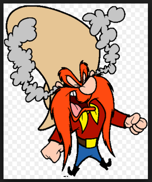
What I like most about the characters is how they don't like other 3D generated characters and after watching the video of one of the characters rigging and it's joints, you can see that it's because they don't actually have any joints, which makes them so bendy and act more like traditionally animated Yosemite Sam. I think it's important to look at references where these studio's might of been inspired by such as the Looney Tunes character but also things like Clint Eastwood's western films. Because these provide vital references that could inspire the locations and make it seem more fitting to the genre.


Whilst I was able to find exciting making of video's for Tumbleweed Tango I was able to find the CG Lead/TD/Generalist's Blog on his input into the project, which states that Tumbleweed Tango was a collaboration between 3DS Max, Maya, Mudbox, ZBrush and Nuke. Which just goes to show that a major Limitation of creating a CG animation is that you need to know how to interchange several computer software packages, and learn how they can intertwine to create a really successful piece.

Something that really holds with me is how he states that the biggest problem they faced was getting the rigged characters from maya into the scene through another piece of software, it took me three attempts at reading the blog post to understand this was the problem trying to understand all the terms. Although it's short I really do believe that it's a fantastic blog post in highlighting a major limitation that comes with making CG animated short films.

http://harperations.com/tumbleweed-tango/

What gives it away that the background is computer generated is how there's a bit in the short where the Cacti form the shape of a Love heart, and also when the flowers bloom. I think these are really charming additions, because I believe in any medium it's important to embrace the flaws and not pretend to be something else. For example in painting, if you paint photorealistically, what's the point when you could just take a photo.

Another feature I think makes this short successful is how the narrative doesn't go the way you think it is going to. I honestly thought, oh here we go some balloons dancing in cacti field, which one is going to pop? But they overcome the obstacles and morph into a balloon bird to fly into the sunset. It's pretty cheesy but it makes for an unexpected ending. What I really like is how Animation World News synopise the film a lot better than I could:
As the characters pirouette around the cactus field to a spirited tango instrumental, they get caught up in the transformative power of love. With each step, twist and turn, they turn themselves into something more than just balloon dogs. In the film’s climatic scene, their love for dance – and for each other – saves them from a perilous situation that’s gone from bad to worse.
http://www.awn.com/news/humble-animates-tumbleweed-tango

One other feature that needs discussing in this blog post is the character design of the balloon dogs. This would of near impossible or very very frustrating to do as a stop motion. And I think it is important to recognise that although I've addressed a major limitation with CG animation for this short, it was conquered all be it with a few glitches, using 3D for balloons dancing in a cacti field is a lot easier than attempting to do this as a stop motion; because you just wouldn't be able to breathe the same life into them. You could explore different materials to make them out of so that they wouldn't pop but actually getting the consistency of a balloon and the air in it wouldn't be as realistic. Therefore I have great praise for the rigging of the characters, not because they look like real balloons, but because of the life and animation given to them makes them powerful characters.

One of the reasons for this is because they don't have faces, yet their actions can speak their words. You can tell they are in Love with each other, through the way they hold their poses, and there tango is so passionate with strong movements, that hold to keep the viewer engage in the dance routine. I also really like how when they fall you can tell they are thinking 'Oh No!' by the held pose of them grasping each other. It's these holds that make it work, because it's really difficult to gage whether it should be longer or shorter, but they've got it spot on.

Another thing I like about the character design is although they don't look realistic they don't look like lots of other CG characters. This is something that I've noticed the studio does really really well, and I'm going to leave you with one of their earlier pieces of work called Homunuclus. In this short the characters start off really cute, even as they are made of mould they still look cute and fury until they ravish each other, and then more characters come out of the stop motion setting and they just push the limits of creativity in 3D CG character design.

Also note that there stop motion background wasn't as successful as there CG background in Tumbleweed Tango, unlike Rob 'n' Ron's, which is super fascinating to notice different studio's strengths.


http://www.humble.tv/

http://www.tumblehead.com/

Tumbleweed Tango Credits:

Sam Stephens: Director/Writer/Compositing
Christopher Mauch: Co-Director/Character Design/Layout
Kevin Harper: CG Lead/TD/Generalist
Andrew Boccio: Animation
Eugen Sasu: Animation
Zeth Willie: TD/Rigging
Chang Kim: Modeling/Textures
Jake Guttormsson: Modeling/Textures
Joe Miuccio: Sound Design/Mix
Erin Berkowitz: Executive Producer
Persis Koch: Executive Producer
Andrea Papazoglou: Producer
Bridgette Spalding: Producer

Sunday 18 January 2015

Final Crit and Improvements


 After showing my playblast at the final crit, I got a lot of feedback for improvements.

1. Bring the ye controller up at the end, so Moom doesn't look possessed.

2. Make sure his arms don't go through his body or his head during the performance, particularly during the section where he dances to the clothes I'm wearing.

3. Feet don't slide they need to come up and then down again.

4. Add more hip action to make it look more feminine, remember the Rita Hayworth blog post?

5. If you have time add follow through to the arm actions.


I started off by changing the colours of Moom using the Hypershade, I had previously tried to make Moom a Boob Tube and skirt with two black cylinders, but they kept having key frames set on them and therefore this ruined the parenting. But i'm really happy with the look Moom has now I think it's much better.

These shots below are from when I was animating Moom for the Crit. I got very stressed at him for not behaving. So I wasn't looking forward to doing the amendments.


The first set of amendments I made was on fixing the sliding feet. At four seconds I noticed there's a little bit of sliding and at 7 seconds there's a jump that looks really unrealistic, he just doesn't land fast enough. So I had another go at it, I found it very infuriating as now I'd changed the colours, it wasn't playing in Maya so I had to keep play blasting it.


Here I added rotation to the feet so rather than sliding it looks like he's pivoting on his heels I think this adds to the illusion of it not being quite right.


During this playblast I added a lot of extra hip wiggle. This was really difficult to do without seeing it play in real time. So I made some more amendments to fix this.


Then the arms went through the body so I had to fix this, and I tried to add follow through but the graph editor was a mess so I moved all the joints seperately on individual frames to make it look like follow through. I think this was the hard way to do it, but I'm pleased with the results.


For my final amendments I just made lots of little tweaks and went back to the feet because I still wasn't happy with the jumps.

Monday 12 January 2015

Modelling


With the shoes there are three main components in the actual shape and then I added on several spikes to make it more visually interesting. I found them really straight forward to make, but I had a difficult time constraining and parenting them. I don't know why but everytime I opened the scene to work on it they seemed to have a broken connection. 


The ring and hair were a lot simplier to model, being two shapes and just a sphere. I think although they are simple they are effective.


With the backdrop I made a big stage, with lots of light reflection and little podium to highlight the spotlight.


I think that modelling was a lot easier than animating, because it's all about dissecting objects into their simpler shapes and working on it. Overall I wish I'd of had more time to make more items for the background, but I also lacked inspiration of what to make and I didn't want it to distract from the dance routine, so I don't mind that's it's fairly plain.


Wednesday 7 January 2015

Inside Out


Inside Out, the next film to come out from Pixar's studio. I chose to look at the trailer of this film for this module, because I think it explains a lot of people reactions and explains the wide range of emotions they go through which cause these reactions. I just thought it's such a fascinating concept and one that would have required the study of so many people, and what they think and how they react and there emotions behind it to get there everyday actions/performance. I think it's made better by adding such a comedic value to it. There were things said in that dialogue that I related to and things that men would relate to, making it an all round family film.

Whats successful in every family film is how they play on the audience emotion, and to add that next dimension into the creation of a film makes the film so much better. With Toy Story it was a relatability and love for toys, with Finding Nemo, it was a sadness and a feeling of loss and with this I'm really hoping it's just going to be down right funny.

One other thing I'm really excited for with the upcoming of this film, is the character design on all the little people in the brain that control the persons action. I like how isn't just one person and there's a series on monologues and different things being said. I think that's something that all interesting people can relate to is there inner dialogue arguing about decisions they have made, but also the range of emotions they can show in that inner monologue can be a lot deeper than that of a human character.

Big Hero Six Character Study


These Big Hero Six character studies show each character entering the room expressing there own personality through the way they open the door and sit down at the table. It's not something I've ever given much thought to that, simple actions can express personality traits of a character. Here's how io9 described the task:
During the early development stages of their upcoming superhero movie Big Hero 6, Disney animators had to figure out how each of their main characters moved. So they made these test animations to study each character's movements, and how those movements reflect their personality.
The animators were given a deceptively simple task: have each of the main characters walk into Aunt Cass's cafe and sit down. We get Baymax with his baby penguin-inspired waddle. Hiro's movements were inspired by one animator's teenaged brother. Wasabi is extremely deliberate in each of his movements, while Honey Lemon is bubbly. This exercise is actually where GoGo Tamgo's bubblegum chewing originated. And Fred, well, he's just an excited goofball.
http://io9.com/disney-made-these-test-animations-to-study-the-characte-1649848324

As well it's really useful for us to see them all together, because it makes each other's characters traits stand out more. For example Aunt Cass is the most social conscience shutting the door carefully behind her, locking it and changing the sign, which is something none of the other characters do. And then the way she sits in the chair, shows us that although she's kind of girly she isn't completely ladylike but she's comfortable in this environment. I can imagine her being really caring yet straightforward and taking no nonsense, because she doesn't have time for it. Where as Hiro has all the time in the world nonsense, you can see he's got lot of time because he put's his feet up is really laid back in the way he enters, but he's constantly on his phone, so I can imagine him being quite annoying to talk to maybe with a short attention span.

This is something that's done in industry to get to know characters and play with them before animating them officially, and is something I wish I had done before doing my project because it makes sense to do, I feel like my Moom's actions change pace halfway through and maybe this would of rectified that. Here is the trailer for Big Hero Six, coming to UK cinema's this month.

Nexus Production Studios


I decided I really wanted to look into 3d CG animation used in commercials and as infomercials.

The advert above is two minutes of a ridiculous narrative. I still can't get my head around the fact that you feel sorry for all these characters who look like weird off coloured potatoes running round a city and then the red herring twist is just something you would never ever expect. I think for this reason, the narrative is just incredible and if I was marking it out of ten I would give it an eleven. The fact that opening scene really gets you to resonate with the little builder potato, because you know he's just doing what we do, working for a better future and drinking till it comes. I think the pauses are perfectly timed to draw out his sickness without the viewer getting bored.

Secondly I would like to discuss the actual animation in this advert, because I think technically, there is a lot going on. They've created almost a whole city, for barely any air time. Which I struggle to understand, until I examined it in closer detail. The production company have actually been insanely clever here, a lot of the scenes where theres lots of people have quite a lot of it repeated, for example the one where it has people passing in a square format, that square is shrunk and moved further away to give the impression of more people. And when it's the scene on the bus, it's in such closed quarters, it feels cramped without having a lot of characters on the screen so therefore there is less animating to do. This is repeated several time by have low angled shots pointing up to the focal character in close affinity so less has to be put in. And then when there's big shots there's lots of characters repeating the same action to look busier. I don't think it makes this animation less of anything, it's very commendable, because obviously when there's a client involved there's a timescale and a budget and the reason I chose to look at Nexus is because this is what they're good at, I think there shorts for entertainment aren't as effective as pieces of entertainment, but all their commercial work is really effective. But this is just my personal opinion.

Another thing I really really like about this piece regarding it's visual aesthetics is the way the creators have handled the lighting. The city is made to feel dank and dark with a very noir style lighting ephemera. Which I think adds to the mystery of the twist at the end because it subtley makes it feel like a detective show and like you want to work out what's wrong with the potato characters so I think it taps into your subconscious and I really like that feeling that it can be done through effective lighting. I think you can't work it out though because it's so short and so fast paced you don't actually have time to think about it properly and I think that's why it's so successful, that and it plays on your emotions.


As far as looking at 3D CG animations for commercials go I think although it's chosen a lot of the time because there's cheats in way you can do things faster therefor you can give the client a cheaper quote than a studio that would do it traditionally, I think sometimes they don't work, in a way that is as effective, therefore they have the potential to be forgettable, but sometimes that's okay if a company is prepared to spend a lot in get it out there over and over so it's hammered into your brain.

This particular Talk Talk advert isn't a favourite of mine, I think it got a great narrative and some great characters and had potential to be a great advert but I think it let itself down through the animation of the characters. To me the characters aren't brought to life very well. They seem quite wooden. I know that they are meant to be characters that have come to life, but I feel like the animators probably need more time to play with them, I just don't feel like I can believe the epic struggle of Gnome and the terrible fall that the robot and rabbit slippers have. I put this down to the acting of the characters. Which again emphasises the importance of the reference footage and work. It's not that I don't feel that key poses and everything is not fitting to the animation, but that facial animation needs more work. I feel like the eyes never really have a chance to connect with the viewer so you can't emphasise as well with the characters and therefore it becomes a more forgettable advert.

There are a lot of other adverts out there that are good and bad examples of 3DCG adverts I just chose this company because I have never looked into them before and they had a good example of a good and bad 3D CG advert. I think what I really fell in love with, was one of there shorts which was a stop motion.


This short animation took four weeks to make and is a direct commentary on the issues with sustainable farming.

What I think it proves is that traditional methods of commercials and infomercials, can be just as visually pleasing and effective. What makes this particular informercial successful is how smooth and continuous the flow of the narrative is and how successfully the narration plays on the humans emotions for the loves of creatures, big and small and how things should be treated fairly. I think the simplistic models don't detract from this and therefore increase the effectiveness of the message. I feel like this is a pretty strong subject so it might of been as effective in CG animation but I think for me there is a lot of resonance in having the working model background that turns and moves and so on, because there's so much love and care that's gone into it I think people are more likely to appreciate it. Even those of an older age who don't always appreciate CG animation.

Nexus productions have some more great work on there vimeo if you liked these I strongly recommend you check them out, they've even had some oscar nominated work.

https://vimeo.com/nexusproductions

http://www.nexusproductions.com/