Tuesday 31 March 2015

Bingomation

Bingomation

7 - lucky seven
horse shoe turns into a seven then a four leaf clover then a rainbow shines over it with a pot of gold at the end of it
88 - two fat ladies 
belly bouncing ladies as numbers morph
60 - grandmas get fisty
two grandmas boxing both end up with a black eye
53 - here comes herbie
herbie driving over hillside pulling up to reveal the number 53
16 - never been kissed
girl with braces and acne and puppy fat stood at a kissing gate crying, zooms into to badge to reveal her sixteen birthday badge
44- Droopy drawers

legs with pants swishing


So I started by key framing the grandma's fighting, (see vid 60.1), I thought the timing was a bit off so I made the punch a bit longer, and it still didn't seem right after I'd coloured it in so I change it again.


I kind of fell out with it after that. So I'd do as many inbetweens as I should of done. It was just a bit of fun really. I find it really easy to do the idea generation, I feel like in retrospect I probably should've just made an attempt to pad them out more. But I'm okay with that.


Creative CV Briefing

Live Brief for Caris Etherington.

Caris is a student at Leeds Beckett study a BA(Hons) in Events Management. She has recently been invited to a conference in London hosted by a guest lecture who visited Leeds Beckett. Caris was the only person to ask a question and the guest speaker to her to one side and invited her to this opportunity in London, but her advice to her was to bring business cards and update her CV to be a creative CV. The lady given this advice gave her a strict layout on what to put on her Business card and told her to see what she could come up with, regarding her CV. The problem is Caris has no confidence in her creativity and struggles with computer proficiency in designing. Therefore she has asked me to fulfil the task for her.

I spent a good few hours sat down with her, and agreed to do it on the premise I could use it as a live brief. I also think this research and practice will benefit my practice and it will provide practice for when I come to do my own, and I’ll already have some knowledge regarding the subject. 

So first things first the brief requires a Creative Cv:
The guest speaker recommended Caris’ had a quote that resonates with her or a statement that would make her card memorable. Also enlarged it should have her name, Ba(Hons) Event Management Leeds Beckett UK Center for Events Management. Also her linkedin, twitter and email.

Then on her creative CV this took much longer to pull out what’s required, Caris has a lot of related experience, so I started with this, her education and some interests. She also decided she wanted her quote on the update CV.  Now the only thing she really knew is that she want’s it to be a brand iconic selection and she wants the colour purple (we went through so many purples to pick the right one) to be the main theme. She also thought about having diamonds, but doesn’t want to come across too superficial so I said I’d go for more hexagonal diamond esque shapes. We went through pinterest, creativebloq, and some other articles of creative CV’s and I went through my career track tuesday session on creative CV’s with her. And because she wants to get into creative event planning more than the business side, creative CV’s are more popular than they are in the creative industries, which kind of shocked me, but I imagine it’s easier to stand out if you have a decent creative CV because you’re not actually against a whole load of other creatives. One thing that Caris noted when looking at the other CV’s is how fussy american ones are because you have to fit so much information onto one side, and she wants to go for simple and elegant. To fit in with this we also looked at a whole range of fonts, my personal favourite is Mohave but she thought it was a bit too masculine, she really likes the rounder fonts that are more traditional, like glamor and Forum, and midway one we both liked was Simplifica. So I’m going to come up with a couple of different alternative ones in the different fonts. 

We then spent a long time going through her skills gained from each work/volunteer experience and the key points she’d want on this CV, because at the end of the day the reason she needs to take her CV to this conference is because there will be people there that she wants to impress to gain placements and work experience from. Because I know her pretty well, I was able to help her pick the best ones, in the end we went for five, which although this means a lot of information has to be put on the CV it shows a really good depth of the industry. And at the end of the day her education results aren't brilliant but her experience really is so this is what we want to highlight.

After this we went through a whole host of quotes and relating to london fashion week and her work in retail we came across this one by Armani she settled on: Elegance is not standing out but being remembered. 

I think this one is perfect before her, because she doesn't stand out but she is always remembered. We found a few others but they weren't people you’d specifically want to quote.

So the deliverables I really want to focus on is making it clean and professional looking, it doesn't have to look super creative, it just has to look better than average as in the Event's industry people aren't expected to be creative so they have a much lower appreciation of what looks good, which is why people with these CV's stand out a lot more. I've tried doing my own creative CV but it just get's me worked up and upset because I get really perfectionist about it and I get worked up. So I think this will be easier to do because I'm really indecisive and Caris will be able to give me lots of minute changes and pointers to get it right.


Wednesday 25 March 2015

Flat 14


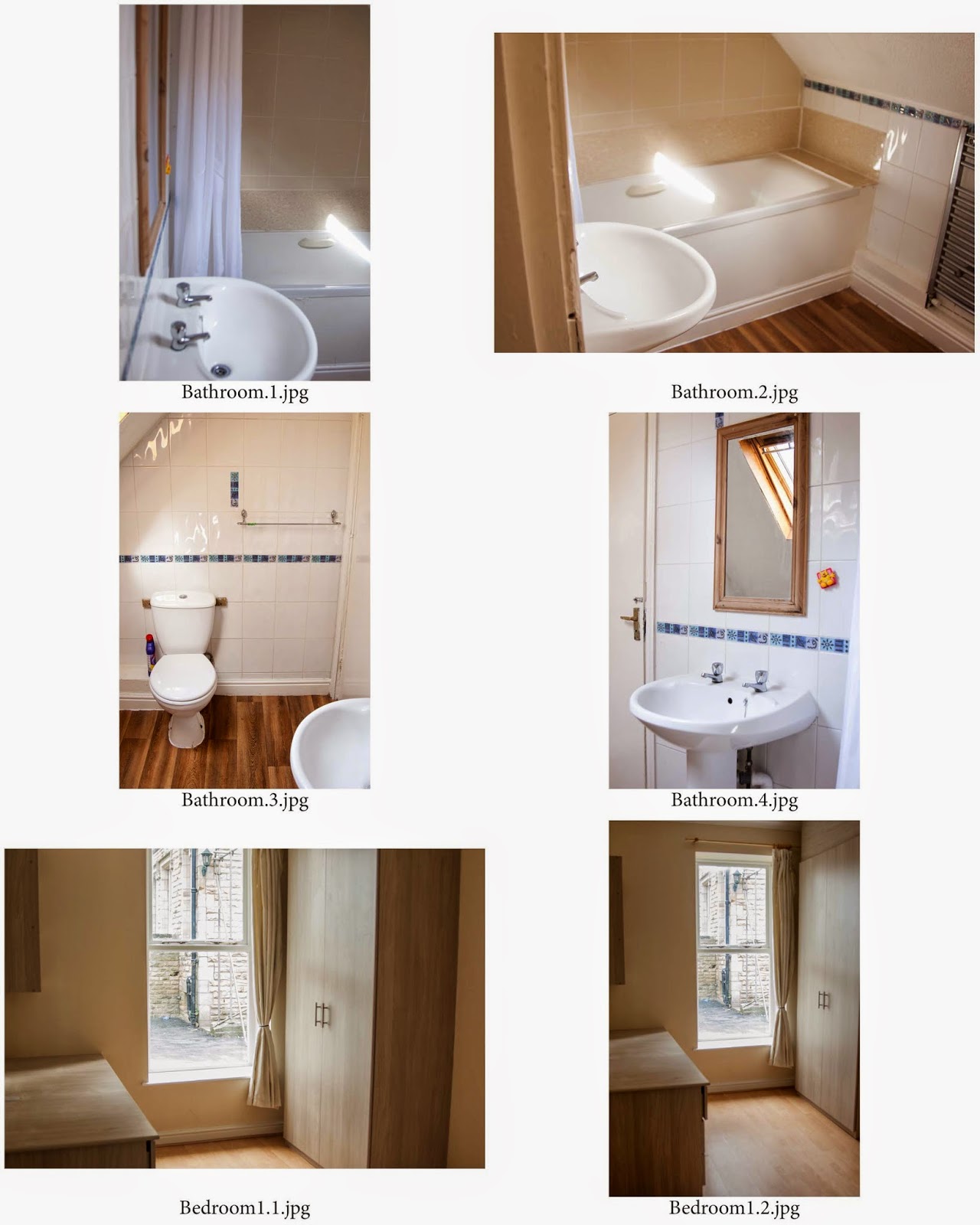
So this is the set from the second flat, I think a couple of them are a bit too dark, I realised halfway through taking them that the ISO needed changing. Oops. But I took enough to have enough decent ones as you only need max five on rightmove/spareroom otherwise you have to pay more, they are a lot better than the ones they currently have for this flat. See Below. 


I think with it being tidier and the layout a bit different it looks a lot bigger without as much clutter in the photo's.  I feel like I have successfully met this challenge even though my standards weren't a lot to beat. I really love working for the landlord and I've been kept on to shoot the other 18 flats so that will be the next few weeks challenge. I think I will definitely use a wide angle lens and check the settings in each flat because I know the flats will vary with some of them being in the basement. I have also already written the letter to send to the tenants asking them to make sure the property is clean and tidy, with a weeks notice.


Tuesday 24 March 2015

Vice Development


So for the pitch I'd been making to do list's for both of us to keep up to, I continued with this during production. I was very aware that David needed the background and characters before he could use the puppet tool on them. So I had to work fastly but effectively so we would get it completed in time.


Honestly, I don't love my background, but i think the texture work well with the darkness of the concept of the idea. I knew that I probably wouldn't have another chance to experiment with drawing on the computer, and after the Minnie Cushion debacle I really wanted to prove myself. Although I do look back and think it would of looked better if I'd remained in the inky style, just because it looks a bit different. I also have come to the conclusion that this is what I'm best at. 


So after I sent him the psd files of these images, Dave did his magic with the puppet tool, keyed out the green screen and job's a good one. I think it was super effective this production method because we had a really clear set of pitch boards and because of my lists we both knew exactly what we had to do to get the job completed. 

Submission proofings:


To see the finished ident, please look in studio task 2 folder.


Friday 20 March 2015

Flat 3


To start with I was given the keys to flat 3. The landlord said to me it had been cleaned. It hadn't, I spent three and half hours cleaning the flat, the builders had left saw dust from where they'd put the shelves up, tab ends, all kinds of chewing gum. Food marks all over the kitchen area it was pretty gross (I invoiced these three hours!!) I took roughly 120photos of the flat, and these ones are the ones I chose to edit. I think If I continue this job one the other flats I'll use a wide angled lens, at the minute I'm just using a normal canon DSLR. After doing my research what I've suggested is that they don't include any of the photo's of Bedroom 2 because it is significantly smaller than the other too and even squishing the camera into the corners I couldn't make it seem larger than it actually was.


I'm quite happy with the photo's I've taken. (there is another contact sheet in the development folder than blogger wouldn't let me upload) In the last two on contact sheet 4 I got the table leg closest perfectly on the line, but it's made the staircase look very strange. It's a very iggildy piggidly house though. I don't think they will have a problem letting out this flat, or getting viewings once it goes live online. I think If I'm going to do all of these flats, I'm going to have to get faster at editing them once they are uploaded from RAW. I think It's something that I can't take a lot of time over because at the end of the day it doesn't need to be perfect, and I don't want to be wasting time over that. So with the next one I'll try do that part faster.


Wednesday 18 March 2015

Photography Research

I haven't done much photography since foundation, but I think it's a skill that crosses with composition of animations frequently so I think it will improve my skills that way.

For my research I decided to look at properties on the market, as the flats in Spring Bank House are primarily 2-4bed, I looked into a few 3 beds. What shocked me is how many on the market literally are just pictures of the front door.

Property 1
http://www.sugarhouseproperties.co.uk/property_details.php?searchtype=professional&bedrooms=3&rentMin=0&rentMax=90&ddm_order=2&id=1433059950
Granby Place


I think this property has good photographs with lots of light, but I think what would put people off is the smallness of the communal area, for a three bed it is really small.

Property 2
http://www.redbrickproperties.co.uk/property-details/2237226/
Trelawn Terrace


What I like about the photo's of this property is how in the living room, they have taken photo's from multiple corners of the room. I think being new at this, this is going to be a good approach for me to take them from each corner and choose the best ones that offer the most variety.

Property 3
http://www.cityred.co.uk/property-to-rent-in-leeds/3-bedroom-house-to-rent-in-leeds/2055338222
North Grange Mews


The photo's on this property are such bad quality!! Major no no!! Also I don't think the property is shown in it's best light as it's quite untidy/cluttered. If the landlord keeps me on I will definitely write a letter to ask the current tenants to tidy.

Property 4
http://www.rightmove.co.uk/student-accommodation/property-47984663.html
Belle Vue Road


I chose to also add these to my research blog (I have looked at a lot more than these) because I thought it was a reoccurring trend that the photo's were taken from a higher perspective looking down. I personally think that this might not show off it's space to it's best light. However this spacious property is properly good enough without needing jazzy photo's because it sells itself. A blank canvas.


Wednesday 11 March 2015

Hyde Park Properties

My landlord approached me and offered to me an hourly rate of seven pound an hour, if I would be willing to photograph all the flats (20 of them) in Spring Bank House. He is struggling in appealing to the modern day student and when he bought the house in the nineties, it was a different structure to get prospective tenants, but now with right move and spareroom, the process has changed. So my first steps in gaining the tenants is to go round a photograph all the flats. This is an ongoing brief for March/April/May/June. I will also be doing viewings of the flats and working in the office. So I have had my office training and I am using the photographs of the flats as one of my individual briefs.

My landlord realised he was taking a risk to employ a student to do this, so we agreed to photograph 2 of the flats and if they are deemed worthy he will get me to finish them and also give me the task of redesigning his logo/letterheads and all the sheets in the estate that sell the property's from walk in's.


What problem is the brief setting?
Taking photo's of the flats, that shows off the space and makes them look like somewhere a person could live.

What does the brief require?
A range of photo's that will entice people to want to view the property and eventually live there.

Who will benefit?
The landlord will benefit from having tenants, and the prospective tenants will benefit because they will have a good idea if they want to live there. At the moment there are no photo's of the property online.

Who is the audience?
The audience is the landlord primarily, I want to impress him to continue working for him and also entices students and young professional looking for temporary accommodation.


What are you expected to communicate to them?
The key selling points of each property visually, and making the property look better than it is so that they get more people to view them.

How will that message/idea/concept be delivered?
A portfolio a photo's.