Thursday 20 March 2014
Dancing Human Form
Dance animation from Koen De Koninck on Vimeo.
This animation is from an Animation student a couple of years ago based in Brussels. A piece of second year work. I think it is so charming, the student has gained such a real understanding of how the human body moves when dancing and some of the follow through of the excess weight is so well done, it bounces in all the right places. There is a confidence with the movement and it's really nicely done. Although I struggle to believe that a woman of such weight would be able to lift her leg that high. And although the hands and feet are exaggerated it does give her an added daintyness to make you believe that once upon a time a long long time ago she could of been a ballerina.
Another aspect of this animation I really like is the background, the colours are so compelling and the line work makes it look like a very european setting, the details are just perfect. I only hope I can produce something so well don ein my second year.
Ayaka Ito in Collaboration with Randy Church.
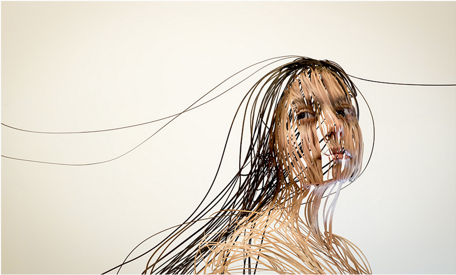


Cinema-Flash Showdown is a collection of images created by a collection of photographs which have then been distorted by a computer program that Randy Church created to give these images that look like portraits made out of ribbons, pushing the limits of photography and creativity. I thought this would be a good example to look at whilst looking at line drawing because it really does break down the human form into so many lines, and the whole point of our exercise was to not concentrate on detail but emphasise more on the lines of movement. And these Ribbons of people really flow like there moving. I think that if there was character made out of ribbons it would make such a cool animation.
My favourite image is the one of the woman drawing on an easel, because I think the portrait really makes it seem like she is putting her soul into the drawing and makes me asks questions about what it is she is drawing. Which at the end of the day is what good design does, makes you ask questions.
Information on the project:
“In the second round of the “Cinema Flash Showdown” project Ayaka Ito and I wanted to pursue two new themes: The Influence of Occupations, and Man vs. Nature. By shooting each environment with and without the model, I would mask the model from the background. Then using my Flash drawing app I’d create 3D splines which were then imported into Cinema 4D. We used HDRI sphere lighting shot on location, as well as skin and cloth materials used in texturing.”
The final 3D render contained an alpha channel to mask the model back into their background. It also gave us a color-perfect 3D line render which could be overlayed to give sense of depth and texture.
Our collective series were printed (12x18”) and displayed at our class gallery show in Rochester.
http://randallchurch.com/cinemaflash.php
http://ayakaito.com/Scribbled-Line-Portrait
Andre Wee
ANDRÉ WEE IS A TWENTY THREE YEAR OLD ILLUSTRATOR, PHOTOGRAPHER AND VISUAL ARTIST FROM SINGAPORE. AFTER 2 YEARS OF SERVICE IN THE MILITARY, JUMPING OUT OF PLANES AND LIVING IN JUNGLES, HE CURRENTLY FINDS HIMSELF BACK IN SCHOOL, PURSUING A BACHELOR'S DEGREE IN ILLUSTRATION AT THE RHODE ISLAND SCHOOL OF DESIGN (RISD) WHERE HE IS STILL SLEEP DEPRIVED FROM WORK BUT VERY ODDLY HAPPY.


A review of his work above. What took me a back with Andre Wee's work is how interdiscplinary it all is, he even has piece of beautiful moving image in his portfolio. What struck me about his life drawing's is how sensitive they same. I'm not entirely exact about the process, but under the title Line Forms, I believe he actuall drew the line forms and them put them on a computer and mapped only certain strings of it to get the soft and sensitive flow of it, yet remain the graphite like texture. I think they are very sensitive studies and look almost ghostly. I really admire he ability to take the projects further and make sculptures out of string mimicking the computer generated images, yet I don't think the lighting does them justice. I am slightly disappointed he didn't play with the shadows and incorporate them into the piece, I'm sure they look much more stunning in real life.
(taken from his about me section)
present the human face and body using opposing, yet equally beautiful means—computer programs and hand drawings, respectively—showing lines that are “not only believable but breathe a life of their own”.
Flow, Form and Force.


This exercise was focusing on several line successions, of exaggerated movement but we only had a few seconds to capture each movement. Although to me it is not visually interesting in the slightest, I can understand the importance of capturing movement and how these could quickly apply to key frames in an animation.


Again another set of quick successive drawings with just a few seconds to capture key lines as someone walked across the room.


The final task named strike a pose was a series of 20 minute observations. I am most proud of the one above in ink of David from the course, because as a person he is instantly recognisable where as I think I haven't captured the other three as well. I tried to focus on quality of line rather than detail.
Overall this brief came naturally to me as it was merely an extension to much faster tasks done in foundation, so I don't think this process meant as much to me as it did the first time round. I much prefer actual life drawing with a board and nice paper and nice material and a couple of hours to work on a piece.
Beauty and the Beast Dancing Scene
One Major example of a rotaton round a character in animation is the Beauty and the Beast dancing scene (starts 1:20). This really emphasises the importance of the need for being able to show 360degrees of a character. Even in 2d flat animations, characters sometimes have there back to you. I think the thing I am most shocked about, revisiting Beauty and the Beast is the sophistication of the camera shots. It never swoops perfectly linear, I am astound at the quality of it being so smooth as well though. They are not straight forward pans it's really inspiring and eye opening of the inticacy needed for industry standard animation.
You Spin Me Right Round

For this project I decided to animate Humphrey, a gargoyle my mum got for the garden then felt too cruel to let him sit outside to be effected by bad weather so he always sits by the tv. I chose him because I felt that out of all my worldly possession he was most like a character I might create, in hindsight I think that actually he's a very intricate guy and probably isn't the simplest of characters to start off with. I also decided to paint my 12 frames of him, because it did say we could use any media and I'd just got some new paints, on average it took me approxiamately three hours to do each frame, and disheartens me how I don't feel like this effort and time is reflected in the final turn around. Overall I learnt from this that I would never paint intricate frames, and in the future I may think about using my time better spent like others, I know a lot of people chose symmetrical objects so they could repeat frames, I thought this was very canny. In future I think I'll approach short tasks like this with the aim of improving my animating rather than creating the best aesthetics.
Gargoyle from fionastucla on Vimeo.
Bag Puss, Looking at Sound in Animation
I figured that the Skeleton Dance and Tom and Jerry are very traditional 2D animations, and it seems unfair to cast aside other types of animation when great sound is in all types. There is especially a standard for sound in the old school stop motions, from paper crafted ones to puppetry, the standard that forms is often a story under a narration, this is true for Bagpuss, The Clangers, Captain Pugwash, Noggin The Nog. It was Oliver Postgate to start of this distinct style and it still carries on in many Children's TV Shows today, including ones like Ballamory.
What I really like about Bag Puss and this general standard, is the really dated musical interlude. Instantly recognisable like a Jingle. I think the most successful theme tune is Pugwash because fifty odd years later it's still instantly recognisable. Another theme is this standard is for the animator/narrator to do Onomatopeia. I think it's really charming, especially with stop motions because it adds to the homely hand made feel.
Sound in Animation
It is virtually impossible to look at sound and not think of the classic Kids shows like Tom and Jerry and The Flint Stones. Previous Animation Directors of MGM, William Hanna and Joeseoph Barbera left to form there own company Hanna-Barbera. The legends of creating animations with minimal talking and the maximum amount of sound effects.
Effective sounds bring the animation to life by emphasising the characters movement. At the end of the day the majority of animation leans on the amount of emphasis in a character because it's not real so to make it funnier actions need to be emphasised to make them bigger and better. Just like with explosions the bigger the better.
Watching this short Tom and Jerry clip shows the nakedness of the animation, because actually the movements are quite basic, in the opening shot nothing moves but the Mouse's Pupil's. But with the sound that part of the animation is anticipation for the packaging coming through the door and the sound helps build the anticipation. All these little actions come together to bring it to life. Hanna-Barbera as a studio were the masters of this, and they had several award winning shows, varying from the Flint Stones, the Smurfs, Scooby Doo and Yogi Bear. In total the won eight emmy's and a Golden Globe. They truly earnt in. Unfortunately the company was swallowed by Cartoon Network following William Hanna's death in 2001.
Sound animations
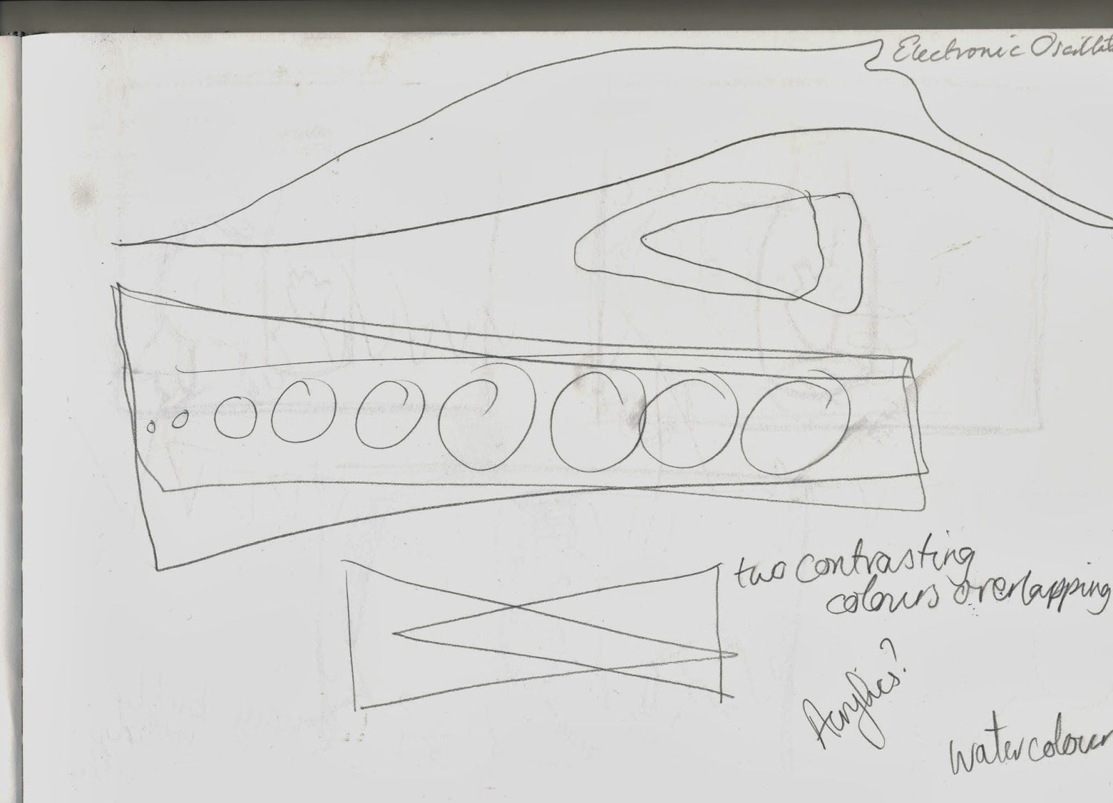
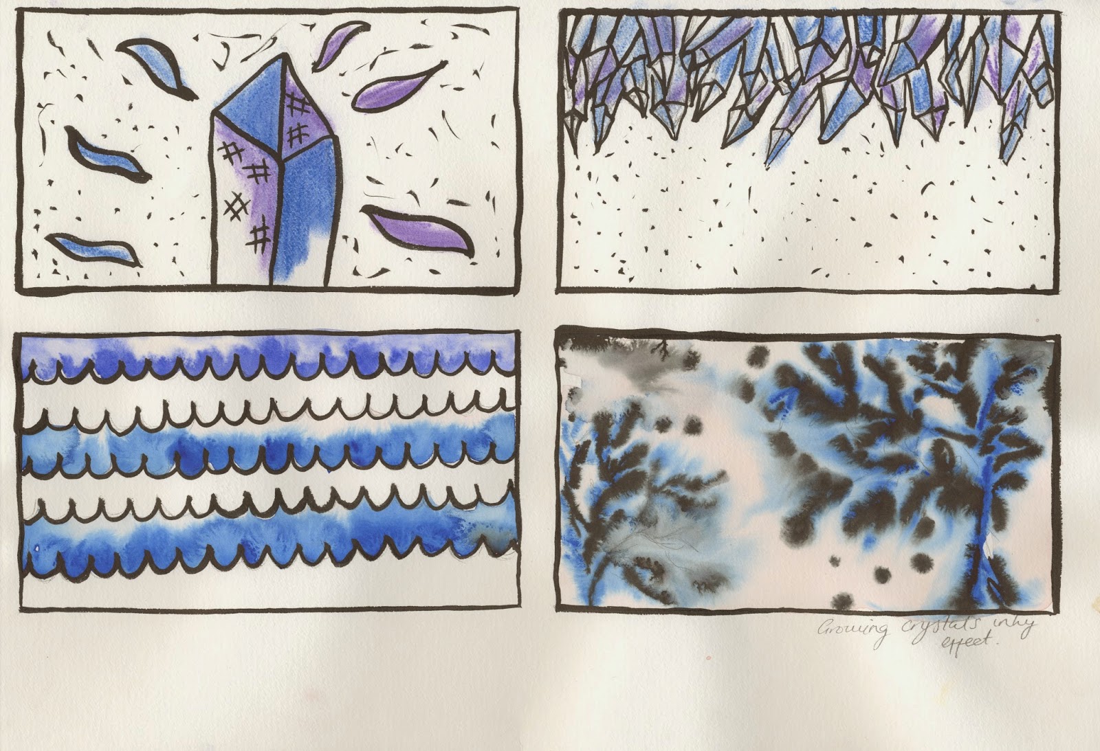
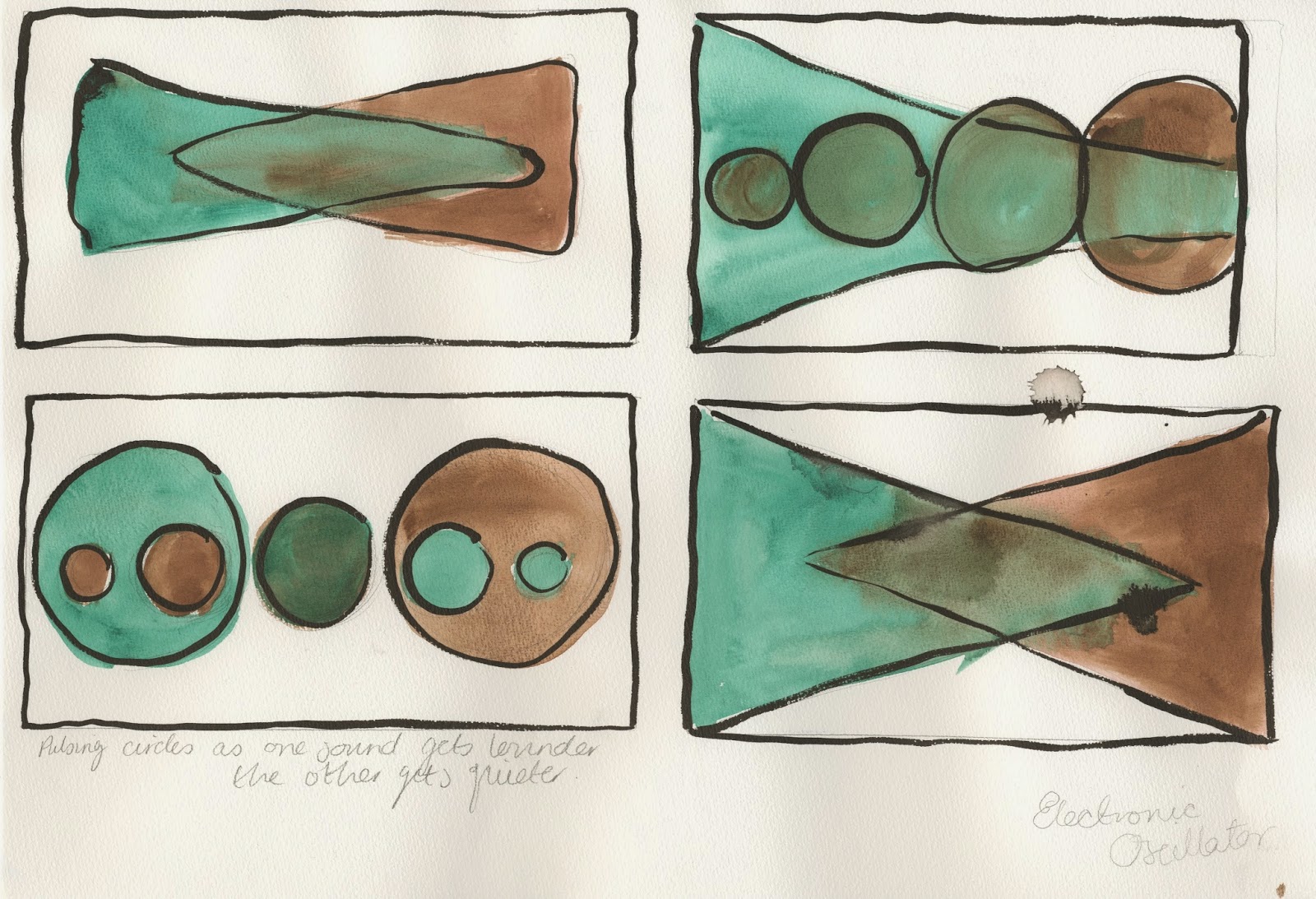
I think I have interpreted the mixed media boards throughly. I am most pleased with the cat alarm animation, even though it has a symbol in. I would of liked to have had more time to make the oscillator one longer because it two sounds in one, but because the clip is so short it is hard to distinguish the two sounds so I don't think it does it justice.
I actually found this brief really difficult, because we were not allowed to represent the sounds with characters, symbols or text and I found it very challenging for it to be abstract, as I instantly visualised characters for the sounds. So therefore I am very pleased with the results.
Skeleton Dance
The first entry in the Silly Symphonies series The Skeleton Dance was very contemporary for the time and Disney found it very hard to get distributed at the time because it was so very non-convential.
Eventually it was the first to be shown at the Cartay Circle Theater in Los Angeles and it took the crowd by storm.
To me what makes it so successful is the use of exaggeration, and how perfectly it is in time to themusic. I also really like how the the sounds are mimic the sounds of the owls, and the footsteps are perfectly in time.
Often Skeletons are quite scary and creepy, but here they are charming dancers, to me this is the inspiration behind Thriller.
Sound Sketches and media tests


When we first received this brief i found it easiest to respond to the sounds with words, so I listened to each of the sounds and scribbled down some notes. I could tell instantly which ones I could visualise so I was able to refine my ten choices through this process.
I then listened to the sounds a couple of times and decided to get some rough sketches down in pencil, so i could gage what media might work best and symbols and marks that felt natural with the sound.


Following this, I started to create compositions with the sketches and chosen media and visualising the movement. I really enjoyed this process much more than the animating.


Subscribe to:
Posts (Atom)